
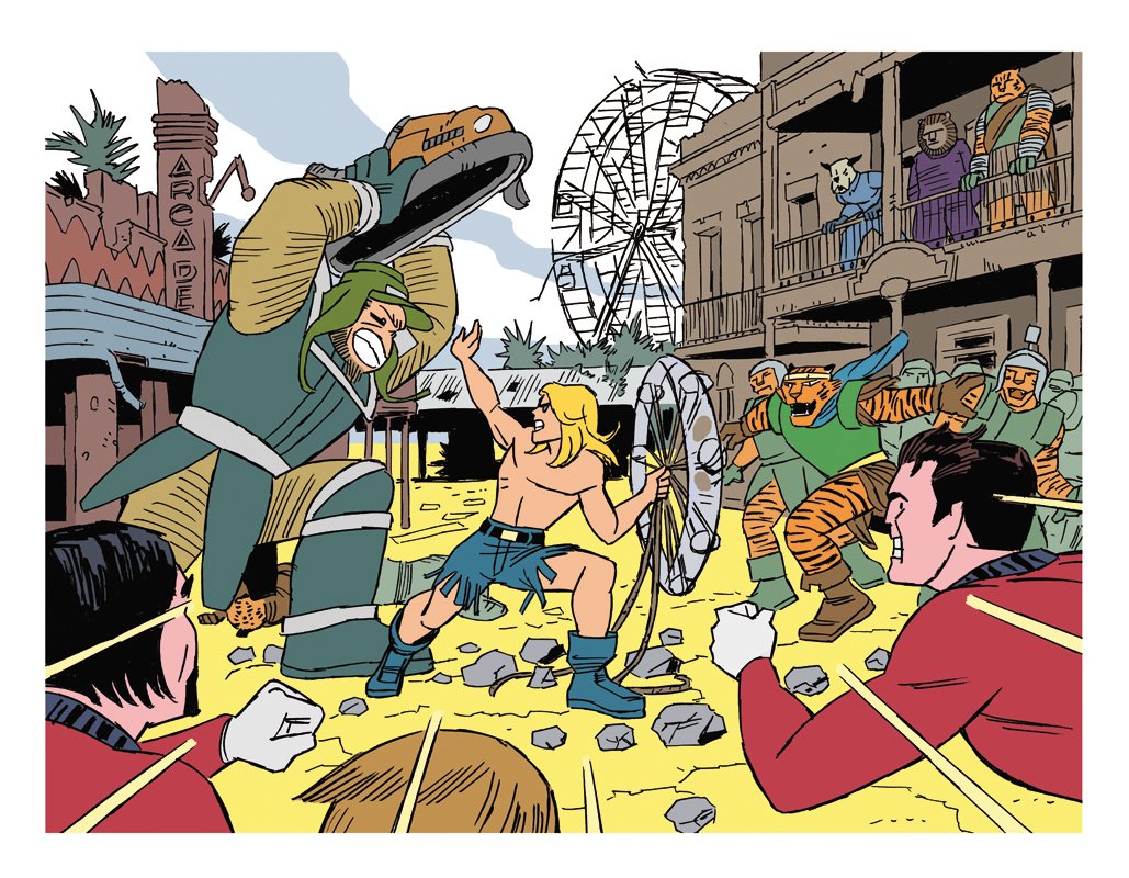
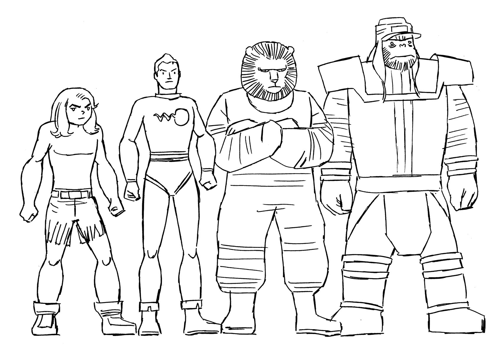
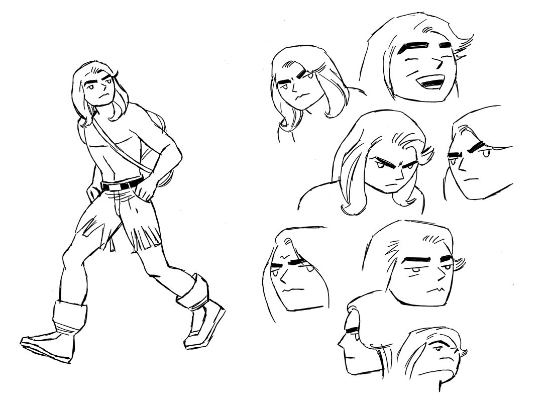
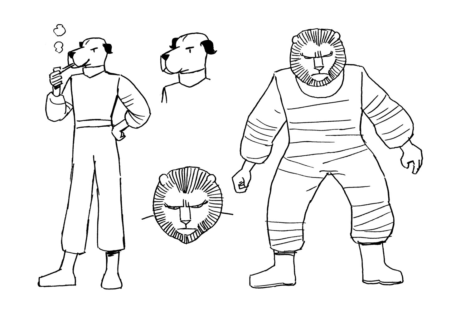
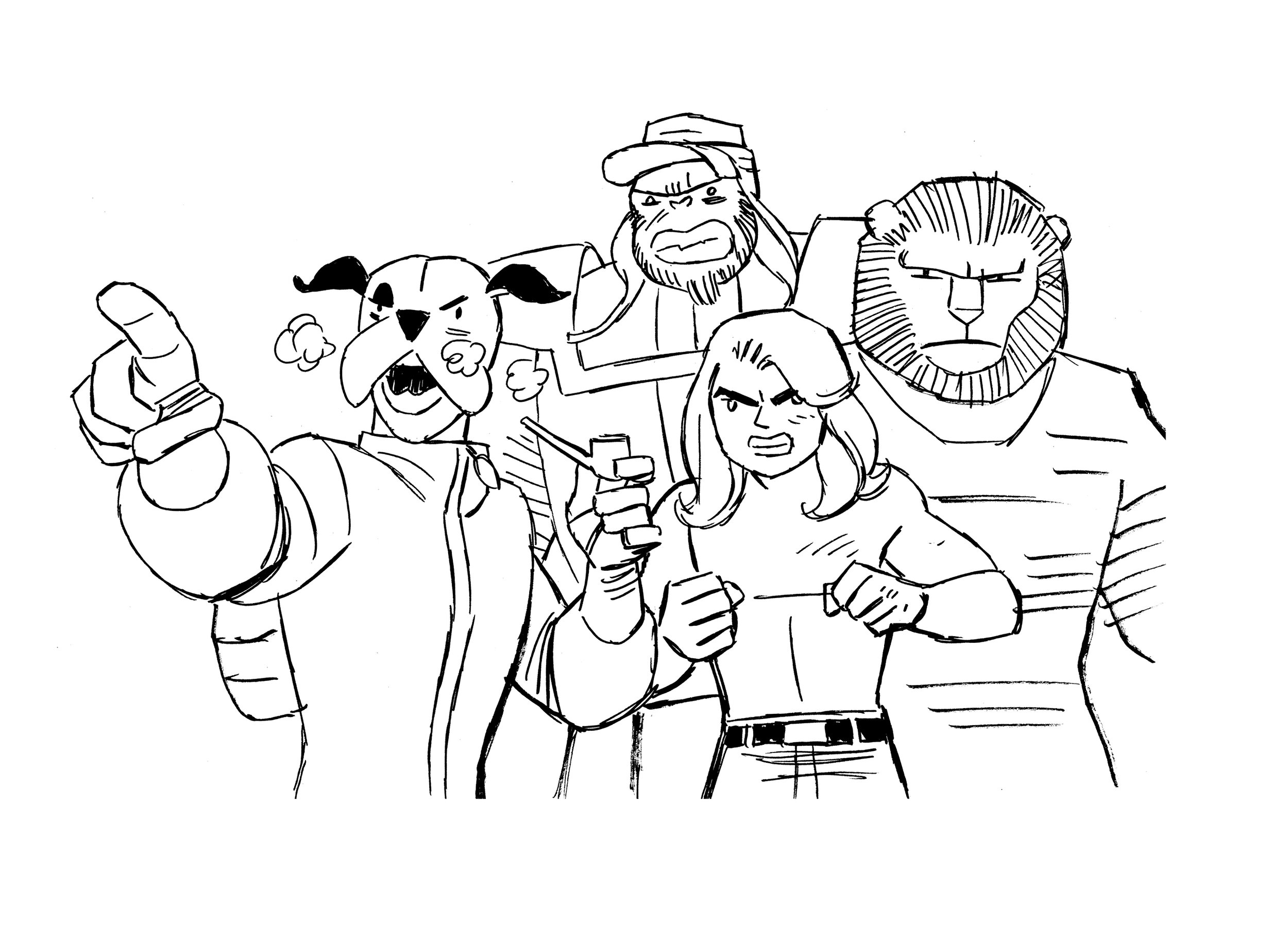
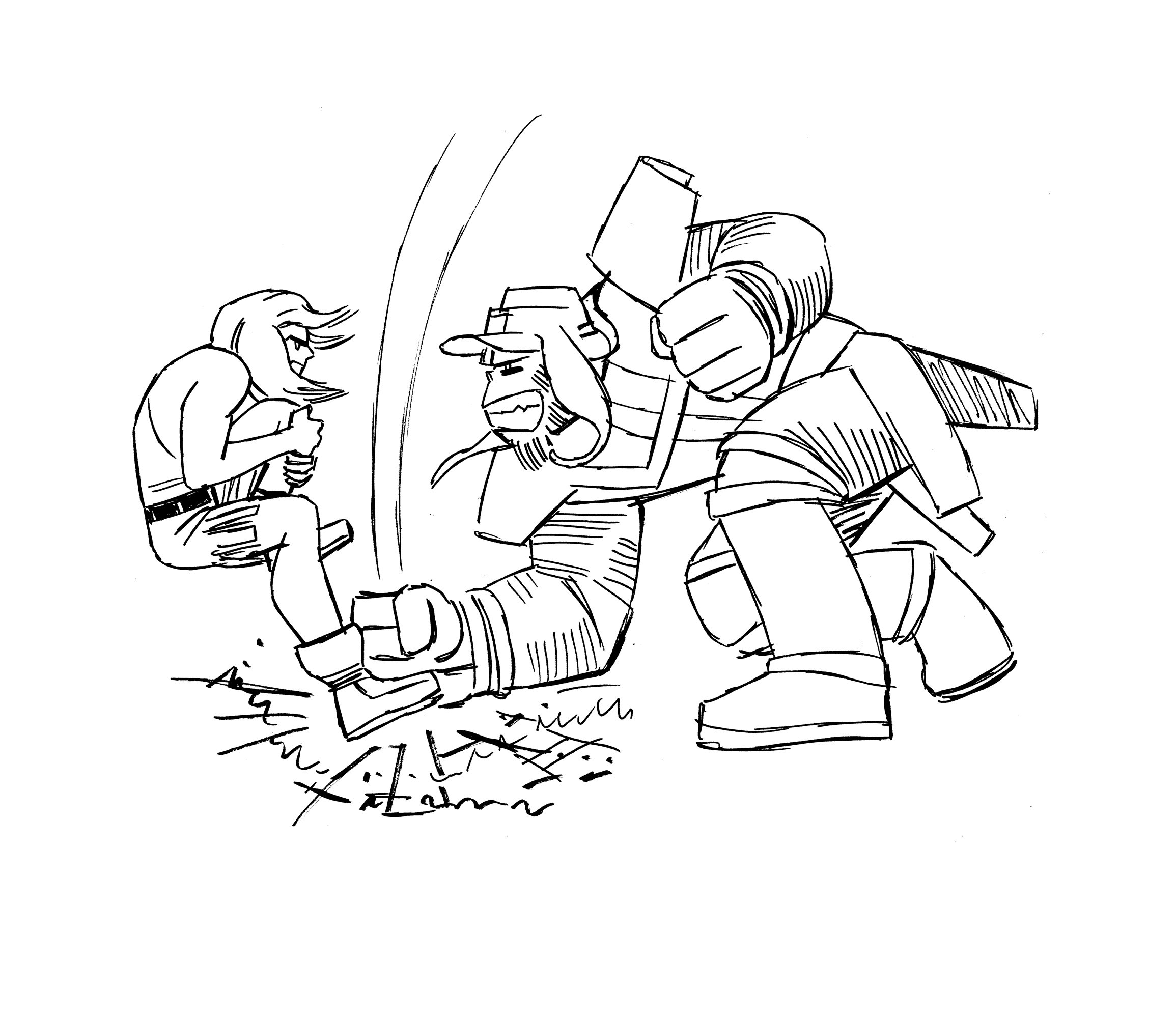
Acompañando al texto una muestra de diseños de animación realizados para dos proyectos de Warner Bros: Kamandi y Los Supersónicos. Diferentes soluciones para diferentes problemas: en Kamandi, casi una adaptación de la serie de cómics de Jack Kirby, intenté traducir el espíritu de su trabajo a un dibujo que facilitara la animación, a la vez que no fuese una imitación de estilos reconocibles, como el Animated americano o el Anime japonés, se trataba, en definitiva, de crear una caligrafía; mientras que Los Supersónicos proponía la actualización de la serie clásica, de manera que me fui por un ‘retro-futurismo’ más radical que el original, con unos diseños creados para proyectar al espectador a una realidad diferente desde la primera mirada, un trabajo más estructural, de redefinición de volúmenes y formas.
Below (and above) is a sample of animation designs for two Warner Bros projects: Kamandi and The Jetsons. Different projects that asked for different approaches: in Kamandi, almost an adaptation of Jack Kirby's comic series, my aim was to translate the spirit of his work into a drawing which transitioned smoothly to animation, while, at the same time, were not an imitation of recognizable styles, such as American Animated or Japanese Anime, the job was, in short, about creating a calligraphy; while The Jetsons proposed updating the classic series, so I went for a more radical 'retro-futurism' style than original’s, with designs created to project the viewer into a different reality from the first glance, a more structural work of redefining volumes and shapes.
KAMANDI
KAMANDI
KAMANDI

KAMANDI
KAMANDI
KAMANDI

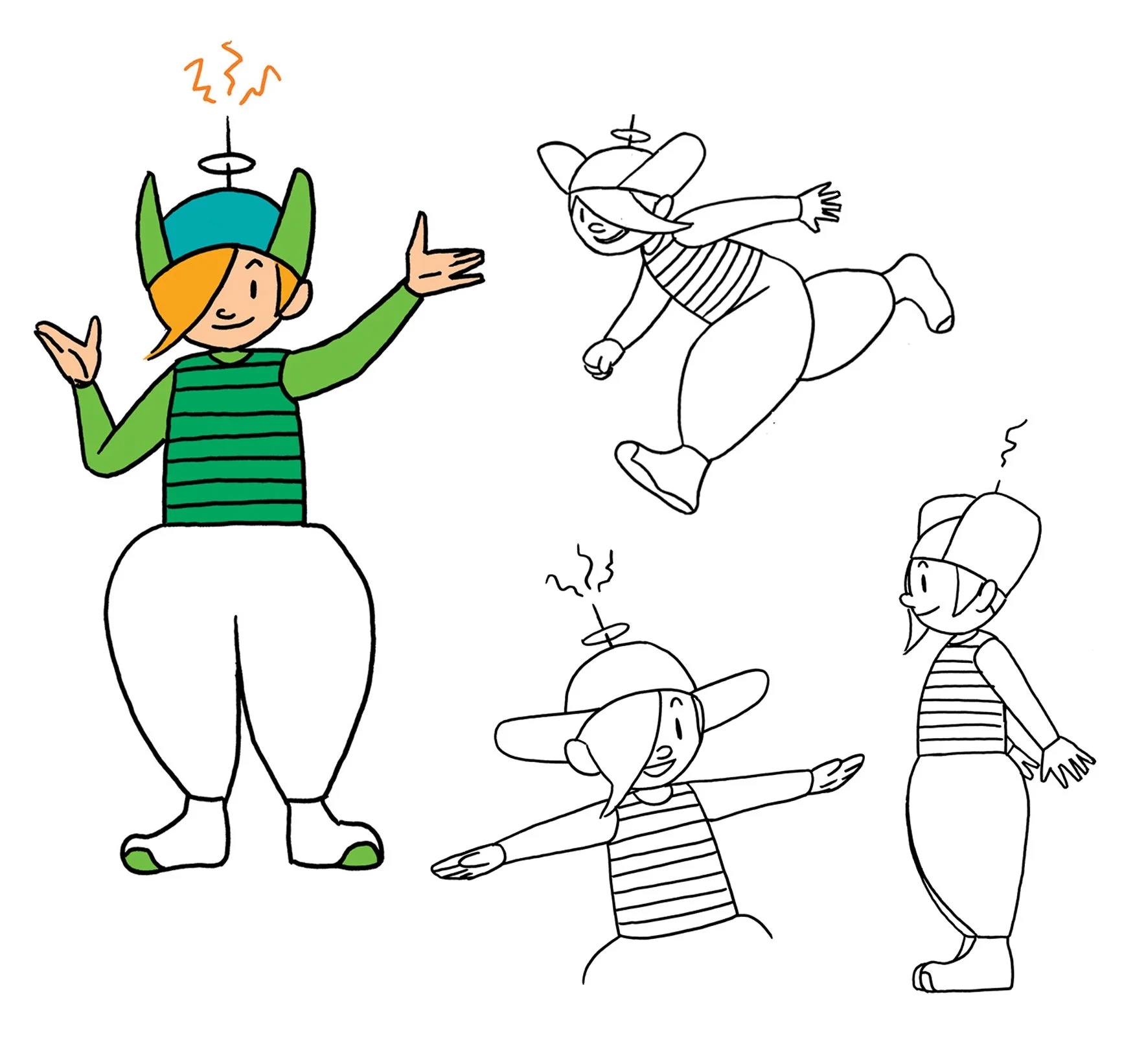
THE JETSONS
Copyright Warner Brothers.